

The Service Station Bruce McLaren's Parents Owned Inspired McLaren's New Logo
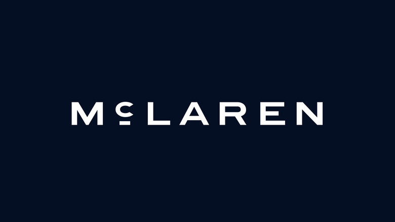
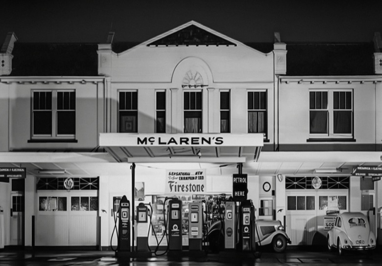
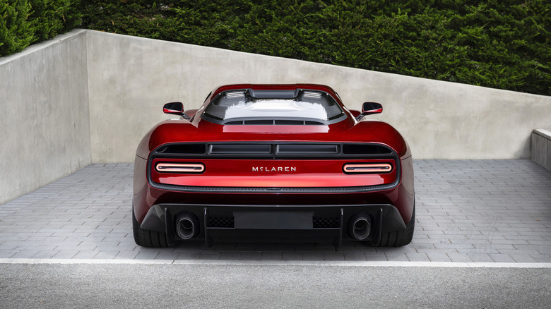
McLaren has a new logo, and while changes of this ilk are often easy to be cynical about, this is one rebranding that's actually rooted in a neat bit of history. You might recognize the new font as the same one seen on the back of the company's new manual McL 6GT supercar, but it's actually inspired by the sign that sat above the service station owned by founder Bruce McLaren's parents. That service station in Auckland, by the way, is where it all began. The car Bruce won his first race in was said to be built there.
 McLaren
The press release included newly edited images of the 6GT with the fresh "McLaren" script on the back, where previous images of it had "McL 6GT," so it's safe to assume this logo will be seen in physical badge form on the brand's future road cars. Including, yes, that now-confirmed performance SUV. For those more fond of McLaren's existing branding, the Speedmark — that's the little stretched-moon badge that often sits on the cars' noses — will stick around, as will the Papaya Orange color scheme.
It'll apply to McLaren Racing, too
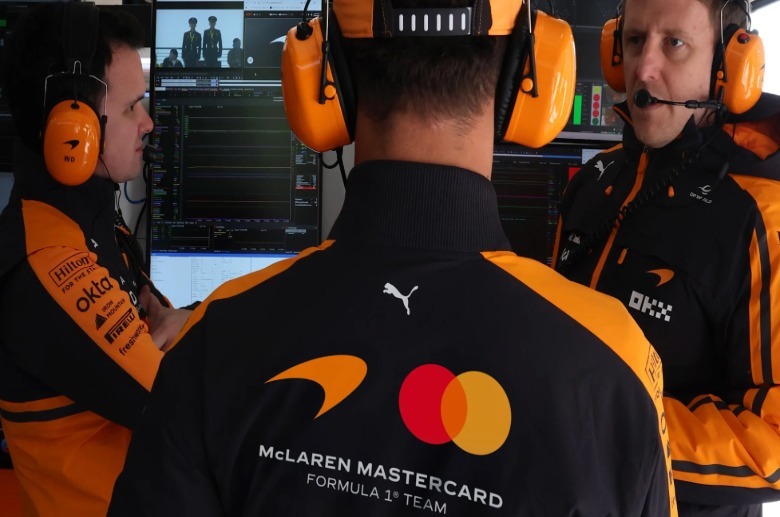
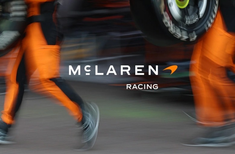
The new logo applies not just to the part of McLaren that sells supercars, but across the entire McLaren automotive dynasty. That means new logos on team kit, merch, and liveries presumably everywhere McLaren goes racing, namely Formula 1, IndyCar, and the World Endurance Championship come 2027. By the way, McLaren isn't shy about its aspirations to complete the motorsport Triple Crown again — that is, win the Monaco GP, Indy 500, and Le Mans.
 McLaren Racing
But par for the course for any time something in the auto sphere changes (or any sphere, frankly), not everyone is a fan. Despite the story it carries, internet commenters and even some within Jalopnik's newsroom have called it out for looking more like a logo for a luxury fashion house, hotel chain, or skincare manufacturer rather than a race team. I think it's pretty cool, though, and definitely one of those things that'll fade into our collective background in about two Grands Prix time. And, for what it's worth, unless Les and Ruth McLaren were secretly time travelers, this is one corporate logo that definitely was not cooked up by AI. That's gotta be a win, right?
 McLaren Racing