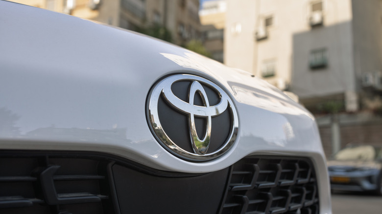
Toyota's Famous Logo Has A Deeper Meaning: Here's What It Really Symbolizes
Hidden meanings behind automaker logos are nothing new. For instance, have you ever wondered why the Audi logo consists of four rings, or where the ducks went from the Cadillac logo, and why? That's right, your favorite automakers love a little symbolism, and global player Toyota is no different. Its gaggle of shiny ovals in a vague "T" shape might look a little generic and bland, but ask Toyota, and you'll get a far more flamboyant reason for the design.
According to Toyota, the two central ovals "symbolize the unification of the hearts of our customers and the heart of Toyota products" — a fancy way of Toyota telling its customers, "Hey, we care about you." As for the background space surrounding those ovals within the larger, external oval, Toyota says it "represents Toyota's technological advancement and the boundless opportunities ahead."
Whether you think that's just marketing drivel or a meaningful message is up to you. But it must be said, Toyota has always strived to produce affordable, reliable cars for the regular folk of this world, and its "technological advancement" sits at second to none in the auto industry.
Don't believe everything you read
Before you dive into the comments to "correct" us, and inform the world that the Toyota logo is actually designed in such a way that each letter of the brand name can be spelled from those ovals, I'm sorry, but you're wrong, and you've been misinformed by internet rumors.
People have been sharing this "hidden meaning" for some time, but it's not the answer Toyota gives, so it's not the one we're rolling with. Sure, it's a neat solution, and perhaps even a bit more interesting that the company's reasoning, but it's still not the official line.
Prior to the design we all know today, Toyotas were identified by the brand name in simple, bold sans-serif type. The current logo was launched in 1989 on the luxurious Celsior model to celebrate the automaker's 50th anniversary. Some 37 years have passed since then, so are we only 13 years away from another redesign? Perhaps Toyota will just revert back to gold badges for its centenary, who knows.
Toyota does agree that the two inner ovals represent a 'T' for Toyota, in addition to looking like a steering wheel. We're not sure we'd be too pleased if our brand-new Toyota came with an oval wheel, but okay, we won't take the symbolism to heart, Toyota.

