The Evolution Of Harley-Davidson's Legendary Orange-And-Black Logo
What's your reaction when you hear — or read — the words "Harley-Davidson"? The name makes people think of cruising off into the sunset on the open road, setting the rules as they go along, with no responsibilities and no worries, just a confident sense of self-reliance and a curiosity to see where the pavement takes them.
Apparently, those feelings can also be inspired by the color orange — which may be why it was chosen as the complementary color to black in the Harley-Davidson logo in 1933. The black itself is probably a function of when the first Harley logo was introduced, back in 1910, before brightly colored advertising became a big thing. Remember, newspapers took a long time to start printing color images: As late as 1979, only about 12% of U.S. papers were using color for photos and other graphics.
The color black has certainly acquired its share of Harley-friendly meanings over time, though, no doubt helped by the black leather gear riders often wear. In fact, experts say that was a direct contributor — along with Coco Chanel's little black dress — to the modern meaning of black as symbolizing rebelliousness and nonconformity. All that said, no one really knows if any deep meaning was originally assigned to either color.
And the actual Harley-Davidson logo has seen its fair share of changes since it was first introduced. So, as we did previously with some of the most interesting car logos, let's take a deeper dive into Harley's legendary graphics.
Harley-Davidson logos: the early years
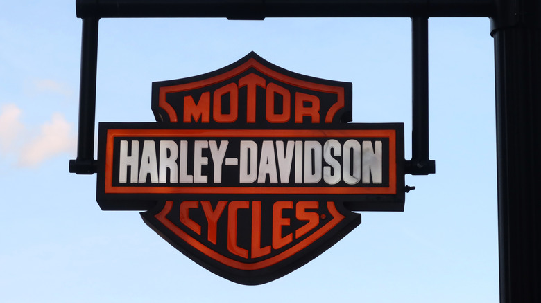
The original Harley-Davidson logo debuted in 1910 as a bar with the words "Harley-Davidson" laid horizontally over a shield containing the word "Motor" above the bar and "Cycles" below. It was in black, gray, and white, and some say it was supposed to symbolize the individuality and freedom you'd enjoy as a rider. For others, it represents strength, grandeur, and ruggedness, or perhaps it has something to do with the unbreakable bond between man and machine. Like the colors, any original meaning seems to be lost in the mists of time. Much like the logo's designer, although one name that pops up is Janet Davidson, aunt of Arthur and Walter Davidson — the brothers who founded the company with William Harley.
Harley-Davidson went patriotic with its 1929 logo. With this design, a large bald eagle holds the Harley logo in its talons as part of an effort to make Harley-Davidson America's motorcycle brand — sort of like how the Dallas Cowboys style themselves as America's Team in football. The black-and-orange color theme followed on the Harley-Davidson logo in 1933, although, like the logo's design, its origins are unclear. Some people say orange and black were initially used for branding for the company's aftermarket products.
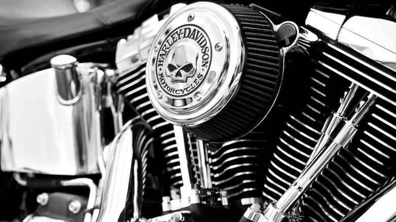
The 1930s also saw the introduction of Harley's unofficial "Willie G." skull logo. Willie G. has since become a major, official part of Harley branding, though selling skull-themed gear is only one of Harley-Davidson's weirdest side hustles.
Harley-Davidson logos: 1953 to present
Fifty years after Harley-Davidson was founded, the company celebrated its anniversary by giving its logo a major overhaul. The company had already debuted a metallic look for its old-school badge in 1949. The 1953 edition was metal as well, but it featured a circular disc with a large "V" engraved on it — honoring Harley's V-twin motors — and with a (much smaller) shield and bar integrated on top of that.
That look had run its course by 1965, so Harley-Davidson went back to its roots with a slightly updated version of its original badge, even reverting to a simple black-and-white color scheme for a time before re-adopting orange-and-black. Harley tapped into its history for its 100th anniversary, too, with an eagle-themed logo so successful that a version was used for its 105th, 115th, and 120th anniversaries.
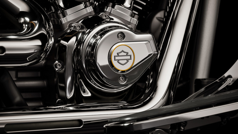
What might have been the boldest change came in 2019. That's when Harley-Davidson showed a fresh, simplified approach to its logo that relied solely on thick lines to create a stylized shield-and-bar without the brand's name on it anywhere. Harley must believe that's enough for recognition everywhere, and it may be right. The all-American motorcycle brand has a global reach that makes it one of the world's most recognizable brands, and it keeps gaining exposure with efforts like Harley-Davidson's New MotoGP Series in Europe.


