How Ford's Logo Changed Over Time (And Why The Blue Oval Stuck)
In a giant parking lot, few emblems hit harder than Ford's blue oval. It's more than a badge bolted to the grille of a Fusion — it really is rolling Americana. A piece of industrial propaganda with a century of history to back it up. But that oval didn't just pop into existence one day. Its evolution was long, sometimes bizarre, and ultimately cemented by a refusal to change with trends of the time. The blue oval endures, while everyone else keeps doodling new logos that just leave us scratching our heads (like Kia's logo, which confuses thousands of people a month).
When Ford Motor Company sputtered to life in 1903, its logo was, simply put, turn-of-the-century overkill. A circular crest wrapped in frilly vines, proudly declaring "Ford Motor Co. Detroit, Mich." It looked more like a medicine bottle label, really. The turning point came in 1906 when chief engineer C. Harold Wills penned the flowing script we recognize even today. Though it's often mistaken for Henry Ford's own signature, it was actually just from a typesetting kit Wills had from a previous life as a letterpress. The lettering seemingly turned the company into something more personable — maybe even a guarantee from Mr. Ford himself. A clever bit of branding that made the machine feel like a promise.
The Blue Oval's Weird Triangle Phase
After landing on the script, Ford spent years struggling with how to dress it. In 1907, the company's British arm crammed the lettering into an oval and sold it as the very picture of reliability and economy. Bold claims, sure, but when you're squaring off against British manufacturing of the era, I guess anything goes.
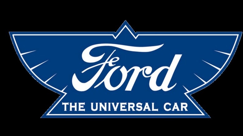
Across the Atlantic, things took a turn with sharper angles. In 1912, Ford unveiled a winged triangle logo and claimed its product as "the universal car." It was supposed to sell all the tangibles — speed, lightness, stability, and grace. But when was the last time you walked into a dealership and asked for the most graceful car on the lot? Henry Ford hated it, and that was that. The logo didn't live or die in a focus group — it died because the guy whose name was on the building simply didn't like it. Oddly enough though, the winged triangle logo has been dug back up for Ford's so-called "next Model T moment," this time with the bottom text reworked to read "the universal vehicle." What was old is new again, apparently.
The proper blue oval emblem officially arrived in 1927, bolted to the radiator of the then-new Model A — the car tasked with following the legendary Model T. That debut locked the oval into the company's DNA, even if Ford weirdly refused to put it on every car in the lineup for nearly 50 years. Talk about commitment issues.
Sticking With Grandpa's Logo
By the 1960s, corporations were busy sanding off the frills, flattening their logos into sleek, minimalist marks. It seemed to be a competition to see whose logo would be enshrined in the Museum of Modern Art first. In 1966, Henry Ford II, the founder's oldest grandson, decided it was Ford's turn and hired Paul Rand, the designer behind IBM, Enron, Cummins, and many more. Rand called the old script-in-oval outdated and pitched a modernist redesign that captured the soul of the old logo with the modernism of the time. Despite it being subjectively one of his better designs, Henry Ford II ultimately passed. The reasoning was simple: What was good enough for his grandpa was good enough for him. Just like his grandfather before him, he focused more on the name and identity — not what anyone else thought.
Call it stubbornness if you want, but by choosing heritage over trend-chasing, Ford made the blue oval into something important. In 1976, the company finally made it official, standardizing the logo across its lineup and adding a 3D gloss. Since then, the tweaks have been minor: A brighter "centennial blue" in 2003 and a flattened version with white script more recently on the 2024 F-150. Through it all, the script and oval stayed constant. The blue oval doesn't just represent a car brand — it represents Ford refusing to let go of Ford.


